
IVF-Life Group
IVF-Life Group — Brand & Digital System for an International Fertility Network
IVF-Life Group
IVF-Life Group — Brand & Digital System for an International Fertility Network
My Role
Senior designer for the group — brand, web, product, campaign, and print. Spain, UK, Germany.
Key Deliverables
- Rebrand: identity, brand book, and guidelines
- Donor-matching mobile application (UX/UI)
- Multilingual website redesign
- Scalable design system across digital, print, and in-clinic
- Multi-market campaign and print production
Context
An international assisted-reproduction network operating clinics across Spain, the UK, and Germany. Patients arrive at the most emotionally loaded decision of their lives, often in a second language, often from another country.
Problem
The group had outgrown its own name. IVF Spain described a single-country clinic; the business was now a European network. Alongside that, the brand read as clinical and institutional at exactly the moments patients needed reassurance, and the most sensitive part of the patient journey, selecting a donor, still ran on paper forms and in-clinic conversations.
1. REBRAND: FROM A PLACE TO A PROMISE
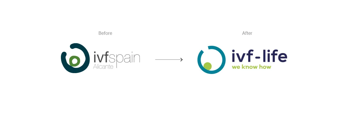
IVF Spain, Alicante → IVF-Life, “We know how.”
The old name tied the group to one country and one clinic. The new one moved the brand from geography to outcome, and the endline gave the network a single claim to stand on across four markets and as many languages.
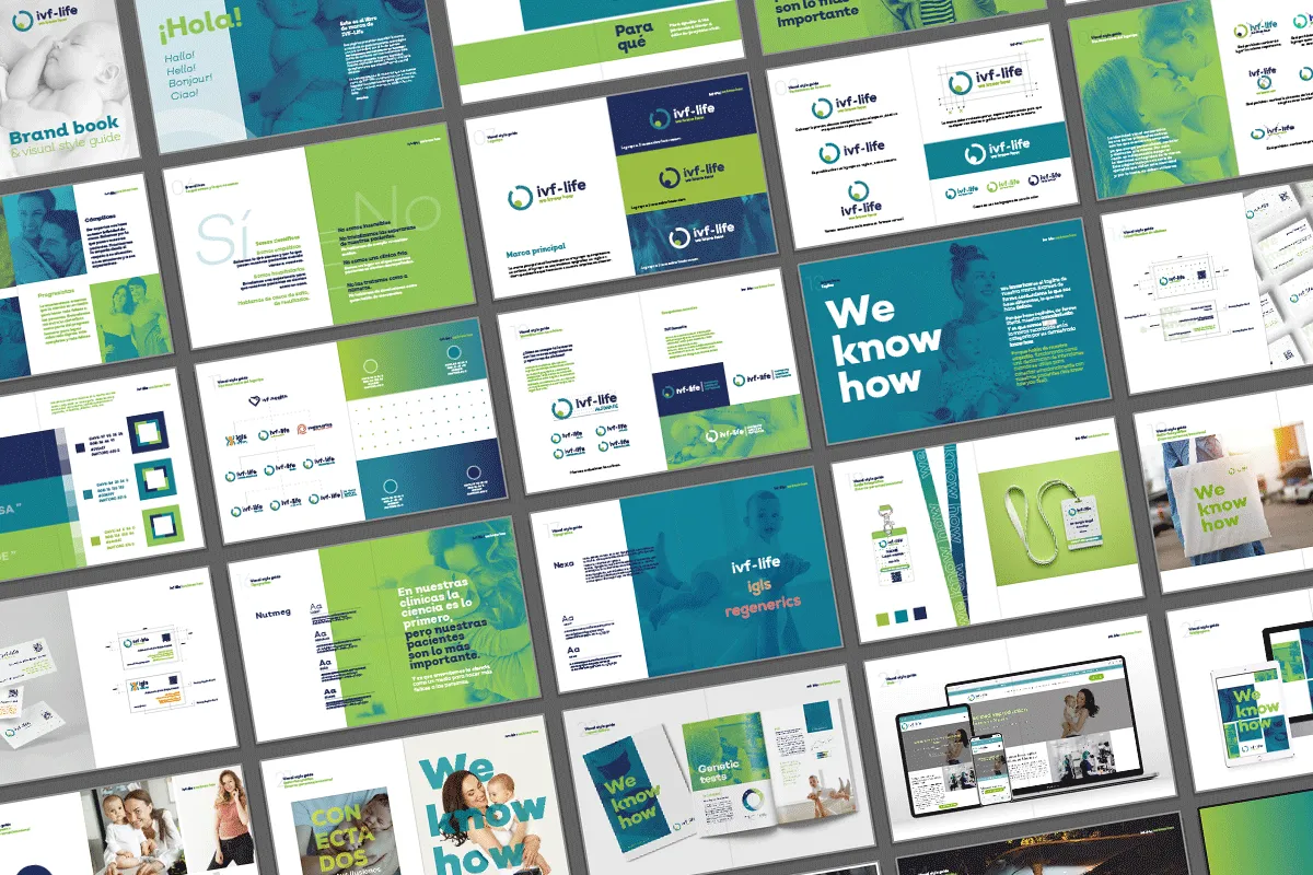
I designed the identity, built the brand book and visual guidelines, and applied the system across every surface the group touched: web, mobile, social, campaigns, print, exhibitions, in-clinic materials, and merchandise.
2. DONOR-MATCHING APPLICATION
The part of the journey that mattered most, and the part that had never been designed.
Choosing a donor means describing, in detail, the physical and personal characteristics you hope to see in your child. Patients were doing this on paper questionnaires, in a clinic, in a language many of them didn’t speak natively, in front of staff.
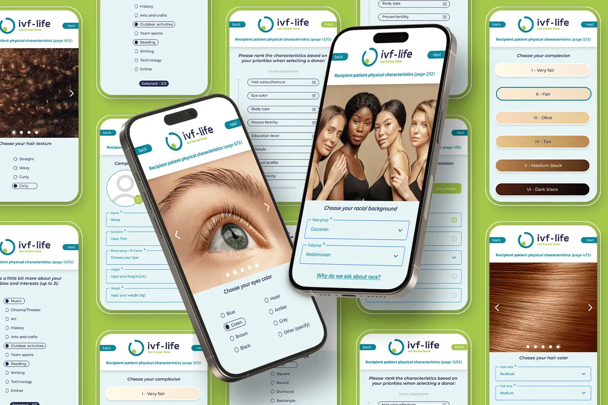
I designed a twelve-step mobile application that moved the process out of the clinic entirely.
What the flow covers
Physical characteristics — hair colour and texture, eye colour, complexion, face shape, height, weight, blood type. Then personal context: education, lifestyle, hobbies and interests. Twelve steps, one topic per step, with page position visible throughout.
Three decisions worth naming
Photographic swatches instead of words. “Wavy,” “olive,” “hazel” mean different things to different people, and even less across four languages. Every physical characteristic is chosen from real photographic samples — hair texture, eye colour, and a six-tone complexion scale — so the selection is visual and language-independent.
A priority-ranking step. No donor matches every criterion, so the clinic needs to know which criteria a patient will not compromise on. Rather than asking patients to fill fields they assume are all equal, the flow ends with a drag-to-rank screen: hair, eyes, body type, proven fertility, education, cultural profile, ordered by what matters most to them. The clinical team receives a priority list, not a wish list.
“Why do we ask about race?” Ethnic and phenotypic matching is standard clinical practice in donor programmes, but the question lands hard when it appears without explanation on a screen. Rather than dropping the field or leaving it bare, I placed an inline explanation directly beneath it. The question stays; the patient understands why it’s being asked.
Outcome
Patients complete the most sensitive step of treatment privately, at home, in their own time — instead of on paper in a clinic room. The clinical team receives structured, ranked data rather than free-text forms.
3. MULTILINGUAL WEBSITE
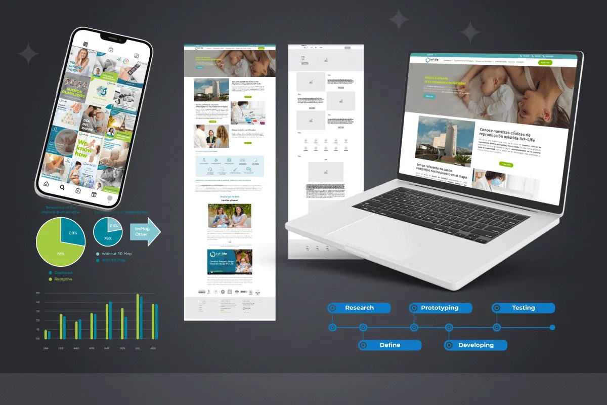
Redesigned across four markets, restructuring how treatment options, success rates, clinical information, and pricing were presented at different stages of the patient decision. Desktop and mobile, built from the same design system as the app, so the transition from campaign to site to product stayed continuous.
Process: research → define → prototyping → development → testing, working alongside the development team through implementation.
4. CAMPAIGN, PRINT, AND COMMUNICATION
The system had to survive contact with every channel the group used:
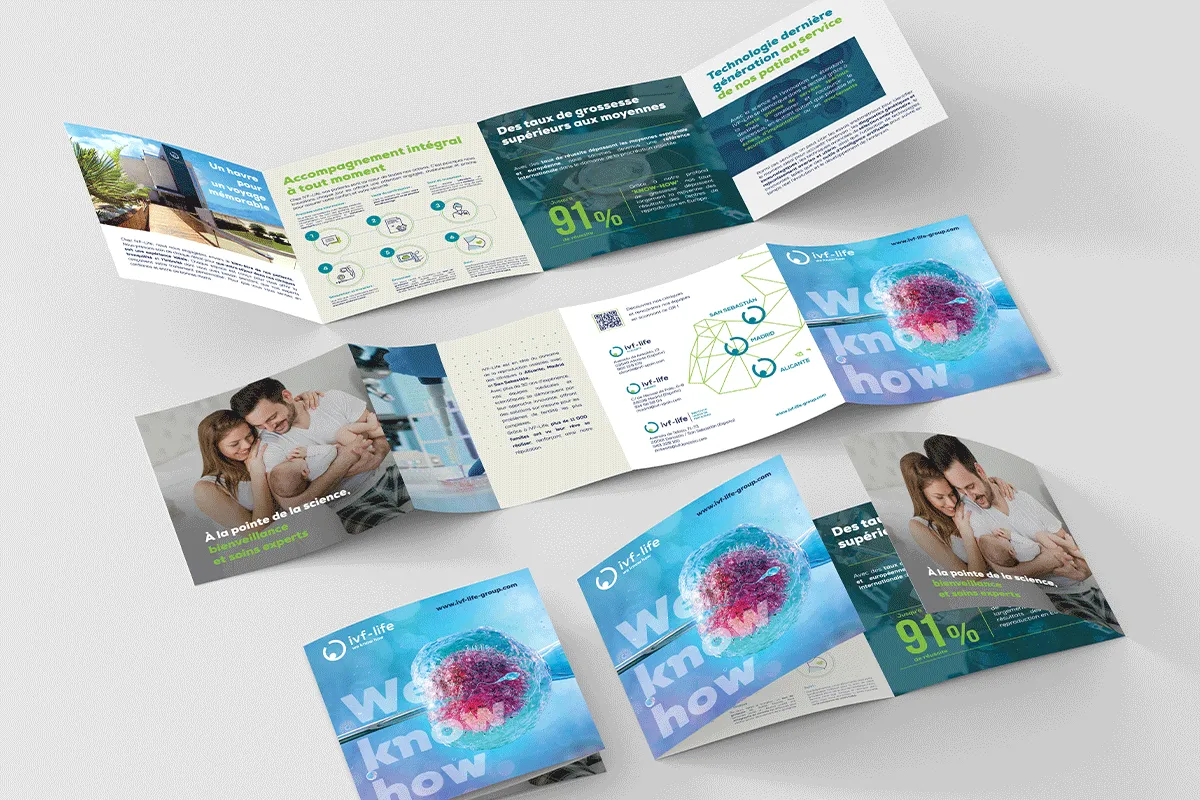
- Multi-language print — brochures, catalogues, and treatment guides in Spanish, French, and German, through prepress and press
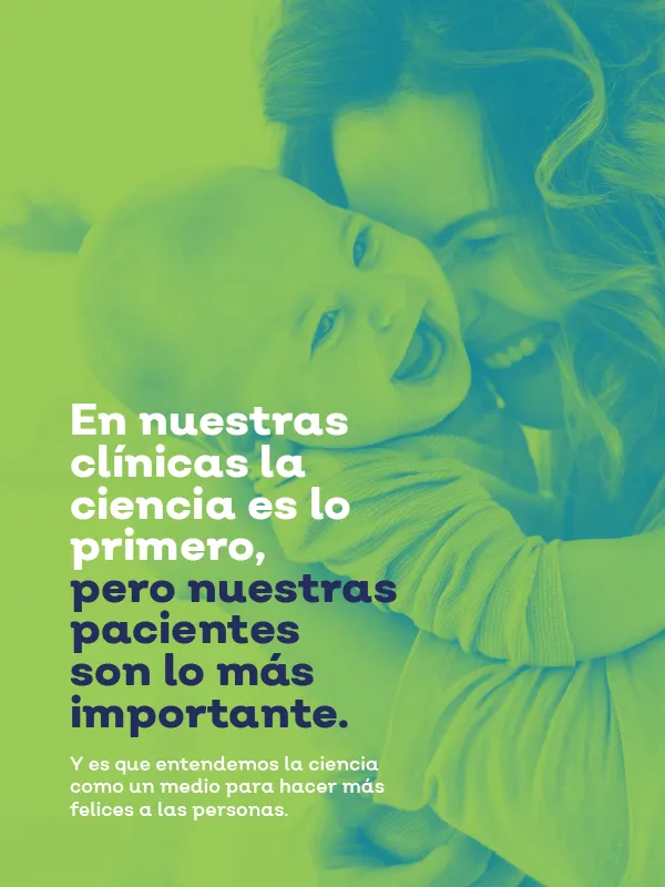
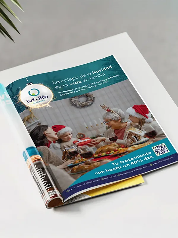
- Press advertising, including seasonal campaigns in national magazines
- Data visualisation for clinical results — implantation windows, receptivity rates, success statistics
- Exhibition and conference materials
- Branded merchandise and in-clinic environmental graphics
- Social and campaign creative adapted per market.
Impact
- One identity carried an international network across four countries and four languages.
- The most sensitive step in the patient journey moved from paper in a clinic to a private, mobile experience.
- The clinical team received ranked, structured donor preferences instead of unweighted forms.
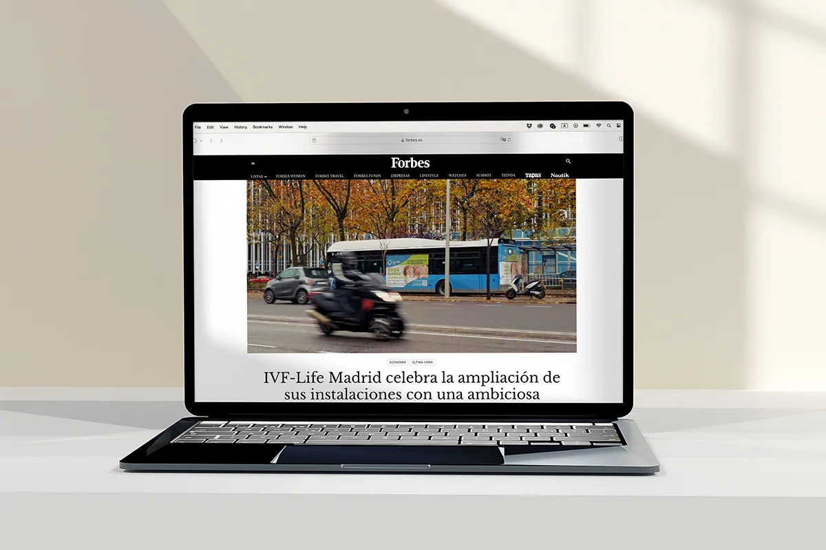
- The group’s expansion was covered in Forbes España.